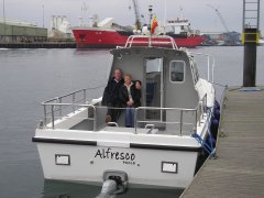
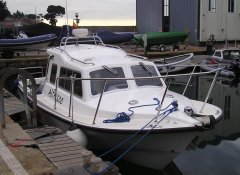
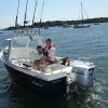
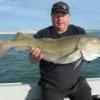
We are a well-established, friendly club with a community of boat anglers aiming to keep our members safe at sea. We have well over 150 members with approximately half owning their own boats. Other club members share fishing trips on members' boats and also go on charter trips.
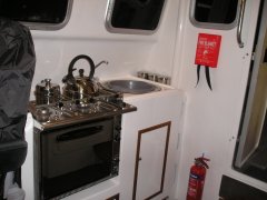
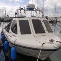
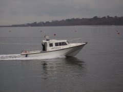
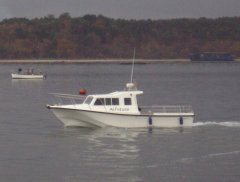
Our members keep their boats on trailers, swinging moorings and pontoon berths. Boat sizes range from small outboard driven dinghies and kayaks up to motor cruisers, some have yachts in excess of 35', all are welcome. The club aims to cater for the needs of sea anglers fishing from boats within club waters that extend from St Catherine's Point in the East to Portland Bill in the West.
Every year some club members take their boats to Alderney to sample the fishing. There is plenty of help and advice for members who want to take their boat there for the first time including buddying up for the voyage over.
We hold regular club meetings, competitions and social events. Club meetings are held on the first Tuesday of every month at the Oakdale Conservative Club, 92 Darbys Lane, Poole, BH15 3EU. See map. Almost every meeting includes a guest speaker covering topics such as international competition fishing and how to increase your catches, tuna fishing, the RNLI, the NCI, salt water fly fishing, local shark fishing, safety at sea and many more.
We also organise courses for our members. Some recently attended by our members are RYA Powerboat Level 2, RYA First Aid, Sea Survival and VHF Operation.
As well as formal courses there is a great wealth of information (both boating and fishing) from our existing members, just post a question on our forum or join in one of our club meetings. There are sure to be people in the club who can help.
How To Join The Club
If you are interested in joining the largest small boat club in the south of England then email us at sales@pbsbac.co.uk and we will email you back an information pack and a simple form to complete.
The initial joining fee is £20 with individual membership £25, or £30 if you would like your whole family to become members. The joining fee is for the first year only.

.JPG.f4047c3a2db610b23ef04395420d1f57.JPG)